25 Common Accessibility Mistakes: Your 2025 Developer Checklist
By Auditbly
•November 22, 2025
•8 min read
We've all been there: a deadline is looming, a feature is launching, and in the rush, we assume that since the UI looks fine, the experience is complete. Yet, the smallest oversight in markup, a forgotten attribute, a misused element. Any can create an impassable barrier for users relying on assistive technology.
Building an accessible web is not about adding features; it’s about removing friction.
The vast majority of accessibility failures aren't exotic bugs, but recurring, predictable mistakes that violate the core principles of the Web Content Accessibility Guidelines (WCAG). For developers, recognizing these patterns is the first step toward prevention.
This checklist walks you through 25 of the most common accessibility mistakes we consistently see across the web, why they matter, and how to fix them efficiently.

Figure: Accessibility is about removing friction for real users.
The 25 Most Common Accessibility Failures
These issues cover a spectrum of WCAG success criteria, categorized by their impact on a user's ability to perceive, operate, and understand your content.
A. Failures in Semantics and Structure
These errors confuse screen readers and keyboard users by breaking the expected information hierarchy.

Figure: Use semantic headings and landmarks to give assistive tech a reliable document outline.
1–6. Semantic & Structural Issues
| Mistake | Why it Fails | The Fix |
|---|---|---|
| 1. Missing alt text on images | Screen readers announce the filename or only say “image.” | Add meaningful alt text for informative images; use alt="" for decorative ones. |
2. Using <div> for interactive elements | A div has no native semantics, making it invisible or unusable for keyboard/screen reader users. | Use <button> or <a>, or correct ARIA roles + tabindex. |
| 3. Incorrect heading hierarchy | Skipping levels breaks the document outline and confuses navigation. | Follow a logical order (H1 → H2 → H3). |
| 4. Missing document language | Screen readers can't pronounce words correctly without a lang attribute. | Add <html lang="en"> (or your language). |
5. Using <b> or <i> for emphasis | These are purely visual and don’t convey importance. | Use <strong> and <em> for semantic emphasis. |
| 6. Empty link text | Links with no text (icons only) provide no context. | Add descriptive text or an aria-label. |
B. Failures in Keyboard Interaction
The inability to use a site without a mouse is a complete blocker for many users.
7–10. Keyboard Issues
| Mistake | Why it Fails | The Fix |
|---|---|---|
| 7. Keyboard traps | Users can tab into a widget but not out. | Manage focus programmatically; ensure Esc closes it and returns focus. |
| 8. Missing visible focus indicators | Removing outlines makes keyboard navigation impossible. | Never remove focus outlines; instead style them clearly. |
| 9. Non-sequential tab order | Tab order doesn’t follow visual order. | Fix DOM order; avoid tabindex > 0. |
| 10. Tabbing over hidden content | Users land on invisible elements. | Use display: none, visibility: hidden, or hidden. |
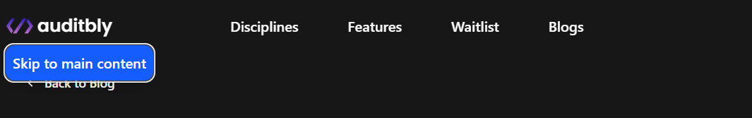
Figure: Always show clear focus indicators and provide skip links.
C. Failures in Forms and Input
Forms are high-friction without proper structure.
11–15. Form Issues
| Mistake | Why it Fails | The Fix |
|---|---|---|
| 11. Missing form field labels | Inputs are not programmatically associated with labels. | Use <label for=""> with matching input id. |
| 12. Using placeholder as a label | Placeholder disappears and isn't consistently read. | Always use a visible <label>. |
| 13. Generic error messages | Users don’t know what to fix. | Provide specific guidance. |
| 14. Unmarked required fields | Users only learn something is required after submitting. | Add required + indicate it in the label. |
| 15. Complex captchas | Visual captchas exclude many users. | Use accessible captchas like hCaptcha or invisible reCAPTCHA. |
D. Failures in Contrast and Media
These directly affect users with visual impairments.
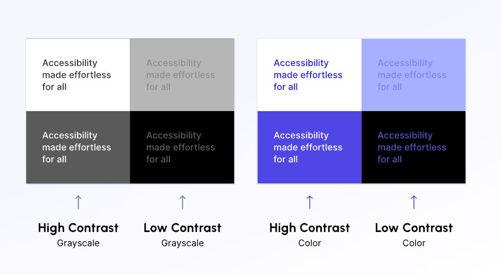
Figure: Use a contrast checker — small changes yield big gains for readability.
16–20. Contrast & Media Issues
| Mistake | Why it Fails | The Fix |
|---|---|---|
| 16. Insufficient color contrast | Text doesn't meet WCAG 4.5:1. | Use a contrast checker to fix colors. |
| 17. Icons/focus states lack contrast | Non-text UI needs 3:1 contrast. | Ensure all UI states meet contrast. |
| 18. Color-only communication | Red-only error text excludes many users. | Use icons or descriptive text + color. |
| 19. Missing captions/transcripts | Video/audio isn’t accessible to deaf or hard-of-hearing users. | Provide captions + transcripts. |
| 20. Uncontrollable autoplay media | Autoplay audio disorients users. | Disable autoplay or mute by default. |
E. Failures in Dynamic Content and Timing
These issues frustrate users who need extra time.
21–25. Dynamic Content Issues
| Mistake | Why it Fails | The Fix |
|---|---|---|
| 21. Missing ARIA live regions | Screen readers don’t announce updates. | Wrap updates in aria-live. |
| 22. Time limits without warning | Users lose work unexpectedly. | Provide ways to extend or turn off timers. |
| 23. Insufficient link target info | New tabs open without warning. | Add an icon and include “opens in new tab” in aria-label. |
| 24. Missing landmarks | No navigation structure for assistive tech. | Use semantic HTML5 landmarks (header, main, nav, etc.). |
| 25. Redundant link text | “Click here” forces screen readers to guess context. | Use descriptive, unique link text. |
How Auditbly Detects These Failures
Manually auditing for all 25 of these issues (and the many more WCAG criteria) is a near-impossible task, especially as websites grow in complexity. It's why developers often rely on a mix of browser tools, manual checks, and wishful thinking.
Auditbly brings the seasoned expertise of a professional accessibility tester into an automated platform. Our engine doesn't just run a checklist; it analyzes the rendered DOM, checking the relationships between elements just as a screen reader would.
From Detection to Solution
When our system detects a specific failure, for instance, Mistake 11: Missing Form Field Labels, it doesn't just flag the line of code. It contextualizes the failure by:
- Pinpointing the Element: Identifying the specific or class of the problematic input.
- Explaining the WCAG Violation: Linking the issue to the relevant success criteria (e.g., WCAG 2.1 Success Criterion 3.3.2: Labels or Instructions).
- Providing the Fix: Offering clear, developer-focused advice on exactly how to apply the missing and attributes.
This layered approach going from the symptom to the root cause to the solution, allows your team to integrate accessibility fixes seamlessly into your existing development sprints.
Accessibility is a practice, not a destination. By making this checklist a routine part of your development process, you shift from reacting to errors to proactively designing for inclusion.
Curious about which of these 25 mistakes might be lurking on your live site?
➡ Check your accessibility with Auditbly (free)
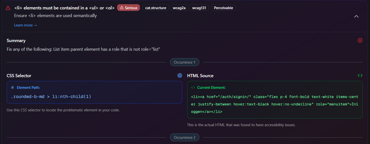
Figure: Auditbly provides pinpoint findings and developer-friendly fixes.