The Subtle Saboteur: Why Poor Color Contrast Destroys UX, SEO, and Your Conversion Rate
By Auditbly
•November 30, 2025
•10 min read
We’ve all been there: staring at a web page where the text just… blurs. It's not a focus issue; it’s a failure of design fundamentals. We’re talking about color contrast, and it’s one of the most deceptively simple issues that can silently kill your site’s performance, accessibility, and bottom line.
A website might look sleek, modern, and perfectly aligned with your brand's style guide, but if the contrast between your text and its background is too low, you're not just annoying users, you're excluding them. This isn't just an accessibility problem; it's a fundamental breakdown of user experience (UX) that search engines now use to assess quality, and it directly impacts your capacity to convert visitors.
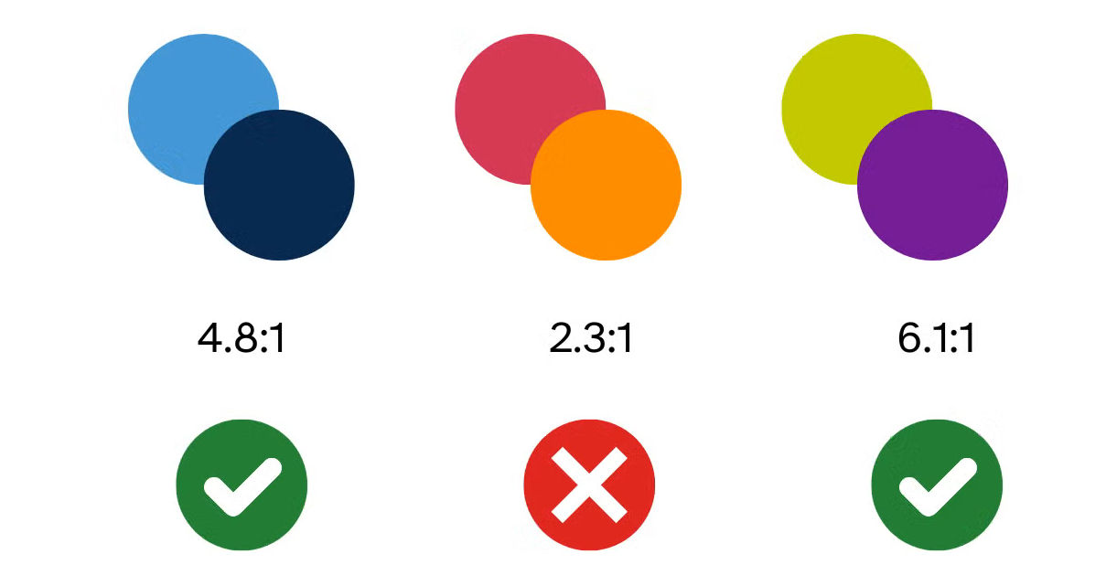
Figure: How different color combinations can affect visibility.
What is Contrast, Really? (Beyond "Does it Look Good?")
At its core, color contrast is the measure of the difference in luminosity or brightness between two colors, typically a foreground color (like text) and a background color (like a div or button). This difference is expressed as a ratio.
The standard that defines acceptable contrast is set by the Web Content Accessibility Guidelines (WCAG). These guidelines are the gold standard for creating inclusive web experiences, and they specify minimum acceptable ratios to ensure everyone, including people with low vision, color blindness, or those simply viewing your site on a bright screen in daylight, can read your content.
For most standard text, WCAG requires a contrast ratio of 4.5:1 at the AA (Level A-Double) standard. For large text (18pt bold or 24pt regular), the requirement eases slightly to 3:1. When a designer opts for that ultra-chic light-gray-on-white text, they are almost certainly falling below these critical thresholds, and in doing so, they’re choosing style over substance.
Why Contrast is the Unsung Hero of User Experience
Think of a high-contrast page as a clear glass window, and a low-contrast page as a hazy, dust-covered pane. Which one makes it easier to engage with what's behind it?
The Accessibility Imperative
The most immediate and critical impact of poor contrast is on accessibility. Approximately 1 in 12 men and 1 in 200 women worldwide have some form of color vision deficiency (color blindness). Many millions more experience low vision due to age or other factors.
For these users, low-contrast text isn't just difficult; it's unreadable. Ignoring WCAG guidelines doesn't just block a user from reading your blog post, it can prevent them from seeing the price of a product, understanding a shipping form, or clicking the checkout button. This is more than just a compliance checkbox; it’s an ethical responsibility that directly translates to market access. (You can dive deeper into all the WCAG standards in our core [accessibility cornerstone article].)
The Cognitive Load Tax
Even users with perfect vision suffer from poor contrast. When the eye has to strain to differentiate the text from the background, it increases cognitive load. This invisible tax on the brain makes reading tiring, frustrating, and slow.
A frustrating experience is a short experience. A user struggling to read your content isn’t absorbing your message; they're fighting your design. They will naturally gravitate toward a competitor whose site is easier on the eyes. High contrast equals reduced effort, and reduced effort means a user is more likely to stick around and focus on your value proposition, not your visual flaws.
The Unexpected Link to SEO Performance
For years, SEO was primarily concerned with keywords, links, and site speed. But as Google’s algorithms evolve, especially with the rollout of factors like Core Web Vitals and the focus on overall page experience, user-centric issues like contrast are creeping into the quality calculation.
Page Experience and Quality Signals
While poor contrast won't result in a direct 'penalty' in the way thin content might, it’s a critical component of Google’s holistic assessment of page quality. If a user lands on your site, bounces immediately due to an inability to read the content, and returns to the search results (a short-click that signals low satisfaction), that behavior is recorded.
Google increasingly uses accessibility and UX metrics as proxies for quality. If their automated tools detect glaring accessibility errors, including contrast violations, it contributes to a lower overall quality score for the page. A high rate of SEO errors (week 6) often correlates directly with poor usability signals, which low contrast is a huge part of.
Readability is Crawlability
Furthermore, while search engine crawlers don't "read" with human eyes, the underlying principle of a structured, legible document is key. By adhering to strong contrast guidelines, you inherently create a clearer, more robust document structure, ensuring that all your textual content is definitively the foreground element, which solidifies its importance for indexing.
Conversions and the Invisible Hand of Trust
The ultimate measure of a website’s success is often its conversion rate. Whether it's signing up for a newsletter, downloading a whitepaper, or making a purchase, a conversion requires a user to follow instructions, read labels, and trust the process.
Poor contrast erodes that trust and breaks the conversion funnel in subtle but devastating ways:
- Instruction Confusion: If the call-to-action (CTA) button's text has low contrast, the user may not even perceive it as a clickable element, or they may misread the instruction.
- Form Fatigue: Low contrast in form labels or helper text makes filling out forms a painful chore. Every piece of friction dramatically increases the chance of abandonment.
- Visual Hierarchy Breakdown: Effective contrast helps guide the user's eye to the most important elements on the page (like headings, CTAs, and warnings). When contrast is poor everywhere, nothing stands out, and the visual hierarchy collapses.
A visitor has to be able to trust that your site is professional, stable, and well-designed. Low-contrast text screams, "We overlooked the fundamentals," which translates to a lack of attention to detail, not exactly the feeling you want when asking for someone's credit card information.
The Fix: Tooling and the Auditbly Advantage
The good news is that fixing contrast is one of the most measurable and easy-to-correct issues in web development. You don't need a gut feeling or subjective testing; you need a tool that provides a concrete ratio.
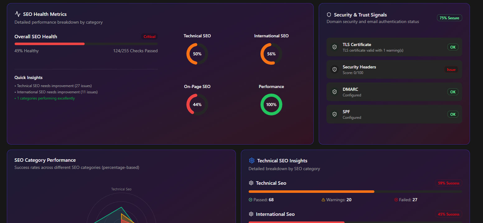
Figure: Auditbly automatically detects issues across performance, SEO, and accessibility.
Manual Spot-Checks are for Amateurs
Relying on a color picker and an online calculator for contrast is slow, error-prone, and unsustainable for large projects. It’s what you do when you don’t have a systematic approach. The real power comes from automating the check.
Professional teams integrate contrast checks directly into their workflow and quality gates. Tools that crawl your entire site and analyze every text element against its background color are essential. This is especially true for complex, dynamic applications where colors might change based on user state or dark mode settings.
The most effective way to tackle this is with a comprehensive, automated audit. The key is to find not just the obvious violations, but the subtle ones, the 3.8:1 ratio that's technically a failure but looks "okay" to a fully sighted developer in a well-lit office.
➡ Use our free contrast-check in the Auditbly scan.
By running your site through a tool like Auditbly, you get an immediate, non-subjective report on every single contrast violation, mapped to the specific WCAG success criterion it violates. This allows developers to triage issues not by guesswork, but by a clear, data-driven report—elevating the conversation from "Does this look better?" to "Does this meet the 4.5:1 ratio?"
The Forward Momentum
Color contrast is a foundational element of web quality. It underpins accessibility, influences user behavior, and subtly impacts your search engine standing. By taking the time to audit your site's contrast and holding your design system to the WCAG standard, you aren't just doing a technical cleanup; you are making a conscious decision to design for every single person who visits your website.
This shift in perspective, from designing for yourself to designing for everyone, is the hallmark of a world-class web experience. Now that you know the hidden costs of low contrast, the next question is: what other fundamental audit is quietly waiting to unlock your site's true potential?