The Core Web Vitals (LCP, CLS, INP) in Plain English: A Complete Guide
By Auditbly
•November 26, 2025
•10 min read
The moment you hit "publish" on a new feature or redesigned landing page, you’re not just releasing code; you're delivering an experience. But how do you measure the quality of that experience? For years, we’ve relied on metrics like page load time, which are fine, but frankly, they’re misleading. A page can “load” quickly but still feel sluggish and chaotic to the person actually using it.
This is where Core Web Vitals (CWV) step in. They are Google’s attempt to standardize the way we measure the real-world experience of a web page, focusing on three key questions: Is it loading fast? Is it stable? Is it interactive?
These aren’t esoteric SEO scores; they are the new gold standard for performance. And if you’ve ever lost a sale because a button shifted right before a click, or watched a user bounce because your content took an eternity to appear, you already understand why they matter.
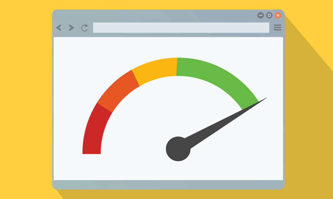
Figure: Abstract dashboard visualizing web performance metrics and overall site health.
What Are Web Vitals, Really?
Think of Web Vitals as the vital signs of your website. When a doctor checks your vitals, they aren't just looking at one number (like your heart rate); they’re checking your temperature, blood pressure, and respiratory rate to get a holistic view of your health.
Similarly, Web Vitals are a set of metrics that measure three distinct facets of user experience:
- Loading Performance: How quickly does the main content appear?
- Visual Stability: Does the content jump around while it loads?
- Interactivity: How quickly does the page respond when the user tries to do something?
The Core Web Vitals are the three metrics that Google currently considers the most important for overall page experience and, yes, they are a factor in search ranking. Let’s break down the three current CWVs: LCP, CLS, and INP.
Deconstructing the Core Web Vitals
These acronyms might sound like something from a NASA mission control room, but the concepts behind them are brilliantly simple.
1. The Need for Speed: Largest Contentful Paint (LCP)
LCP measures the time it takes for the single largest block of content to become visible in the user's viewport.

Figure: A fully loaded page goes through multiple steps, before becoming interactive.
This isn't just about the start of the page load; it’s about the moment the user thinks, “Okay, the page is here.”
On a blog, the largest element might be the hero image or the headline and first paragraph. On an e-commerce site, it's often the main product image. LCP is a metric focused on perceived loading speed. You want your LCP to be fast because a blank screen, even for a second or two too long, is an open invitation for the user to hit the back button.
| LCP Scoring | User Experience |
|---|---|
| Good: seconds | Feels fast and responsive. |
| Needs Improvement: seconds | Noticeable delay, risk of frustration. |
| Poor: seconds | Slow; users are likely to leave. |
The Developer Insight: A poor LCP score usually points to a handful of issues: slow server response times, render-blocking resources (like huge CSS or JavaScript files), or images that aren't optimized or correctly prioritized.
2. The Stability Factor: Cumulative Layout Shift (CLS)
CLS measures the total sum of all unexpected layout shifts that occur during the entire lifespan of the page.

Figure: Lazily loaded ads can push content down, leading to layout shifts.
Imagine you’re reading a news article. You’re halfway down the paragraph, you go to tap a link, and suddenly an ad loads above your finger, shoving the link down and making you accidentally tap the ad instead. That sudden, frustrating jump is a layout shift.
A layout shift is defined as an element moving its start position from one rendered frame to the next. CLS quantifies this chaos by multiplying the impact fraction (how much of the viewport was affected) by the distance fraction (how far the affected elements moved).
| CLS Scoring | User Experience |
|---|---|
| Good: | Stable; shifts are minimal and unnoticeable. |
| Needs Improvement: | Minor shifts; occasionally irritating. |
| Poor: | Chaotic; results in misclicks and annoyance. |
The Developer Insight: The main culprit for high CLS is often un-sized media. If you don't define the width and height attributes on your images or video elements, the browser allocates zero space for them until they finish loading, causing everything below them to jump when they finally pop in. Injecting content via JavaScript late in the page load is another common offender.
3. The Responsiveness Test: Interaction to Next Paint (INP)
INP measures the latency of every single click, tap, and keyboard interaction that a user makes on your page and reports the single worst result.

Figure: Illustration highlighting Interaction to Next Paint (INP) as a key user-experience responsiveness metric.
Wait, didn't we have First Input Delay (FID)? Yes, but INP is the new, more comprehensive metric that officially replaced FID in March 2024. While FID only measured the delay before the browser could start processing the first interaction, INP measures the entire interaction process, from the moment you click to the moment the browser paints the next visual update (the "next paint").
INP ensures that when a user clicks a menu, adds an item to a cart, or expands a section, the page doesn't just look like it's listening, it actually acts on it immediately. A poor INP means your user is stuck waiting, often clicking again out of impatience or confusion.
| INP Scoring | User Experience |
|---|---|
| Good: milliseconds | Instantly responsive; feels snappy. |
| Needs Improvement: milliseconds | Slight, noticeable delay. |
| Poor: milliseconds | Laggy; the user is unsure if the click registered. |
The Developer Insight: High INP is almost always a result of excessive, long-running JavaScript tasks. When the main thread is busy crunching code, perhaps processing a massive data object or rendering a complex component, it can’t listen to or respond to user input, leading to a frustrating lag.
Bringing the Metrics to Life: Good vs. Bad Examples
These concepts click into place when you see them in action, or, more accurately, when you feel them in action.
LCP: The "Waiting" Game
- Bad Experience: You click a link to a recipe. The header, navigation, and footer load in a second, but the main recipe image and the ingredients list, the stuff you actually came for, don’t appear for another seconds. The screen feels incomplete and the user has a moment of doubt: "Is this page broken?"
- Good Experience: The same page uses a high-priority, optimized placeholder for the main image and streams the critical CSS first. Within seconds, the main image, headline, and the top of the recipe text are all visible. LCP is met, and the user is instantly engaged.
CLS: The Shifting Sands
- Bad Experience: A banner ad container is supposed to load at the top of an article. It’s lazy-loaded, meaning there is no reserved space for it. When the ad server finally responds, it injects a tall banner, pushing the entire article down. The reader loses their place and their flow.
- Good Experience: The banner ad container is pre-sized using CSS
aspect-ratioor fixedheighteven if empty. When the ad loads, it fits perfectly into the reserved space, and CLS remains at 0, maintaining a smooth reading experience.
INP: The User Feedback Loop
- Bad Experience: A user clicks the "View Cart" button. The application is processing a large state update in the background. The button highlights briefly, but nothing happens for . The user clicks it again, assuming the first click failed, which actually queues up the cart-opening twice.
- Good Experience: The click is registered, a brief visual cue (like a subtle color change) is painted within , and the actual navigation to the cart page begins immediately. The main thread is free, the response is instantaneous, and the user trusts the application.
The Intelligent Diagnostic: How Auditbly Measures Your Core Web Vitals
You could try to measure these metrics by hand, using browser developer tools and spending hours simulating network conditions. But as a professional developer or agency, your time is better spent fixing the issues, not finding them.
This is precisely the kind of tedious, high-stakes diagnosis that a powerful auditing tool excels at.
Auditbly doesn't just give you the red, yellow, or green light; it dissects the experience:
- Pinpointing LCP: Our audit identifies the exact element that constitutes your Largest Contentful Paint. It tells you its size, its resource file (is it a huge image? a render-blocking font?), and precisely how long each stage of its load process took; from DNS lookup to byte delivery.
- Catching CLS: We replay the page load to detect all visual shifts, reporting the time and location of the scripts or resources that caused them. We turn the vague concept of "layout shift" into a clear, actionable list of elements you need to size or reserve space for.
- Analyzing INP Contributors: Auditbly analyzes the script execution time and identifies Long Tasks, the chunks of JavaScript that clog the main thread and prevent the browser from responding to user input. This gives you a direct line to the functions and third-party scripts that are killing your responsiveness.
Ultimately, your Core Web Vitals scores are more than just a search ranking signal; they are the most honest reflection of the user experience you are providing. By breaking them down and using an intelligent tool to diagnose them, we move from guessing what's slow to knowing precisely where the performance budget needs to be spent.
Ready to see exactly where your Core Web Vitals are lagging and what to do about it?